The third edition of Kapot Grappig marked the first anniversary. After two successful editions, expectations were high: the series had to move forward without becoming a repetition. The campaign builds on the existing visual system, same rhythm, same logic, but darker and sharper. The only color is a bold magenta. All photography is black and white with extreme contrast, causing the black areas to fully dissolve into the background. What remains are faces, details, moments, stripped of context and razor sharp. 
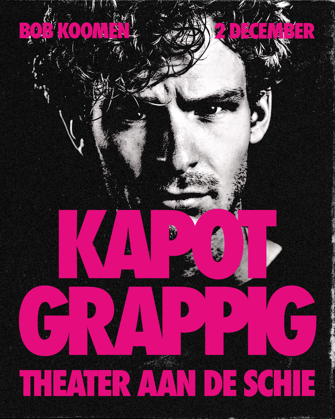
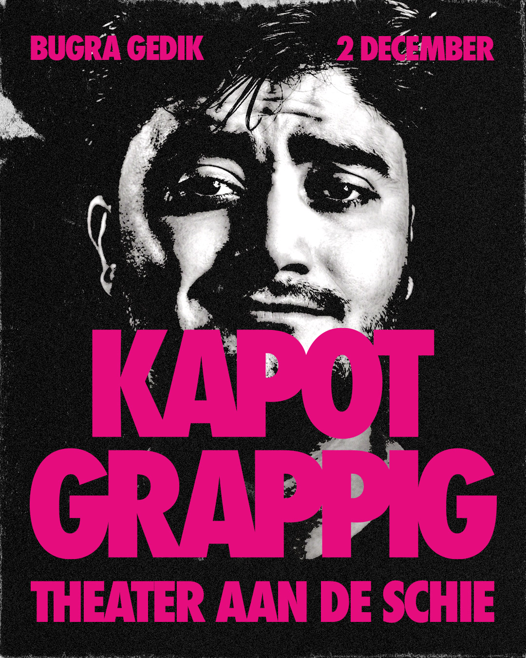
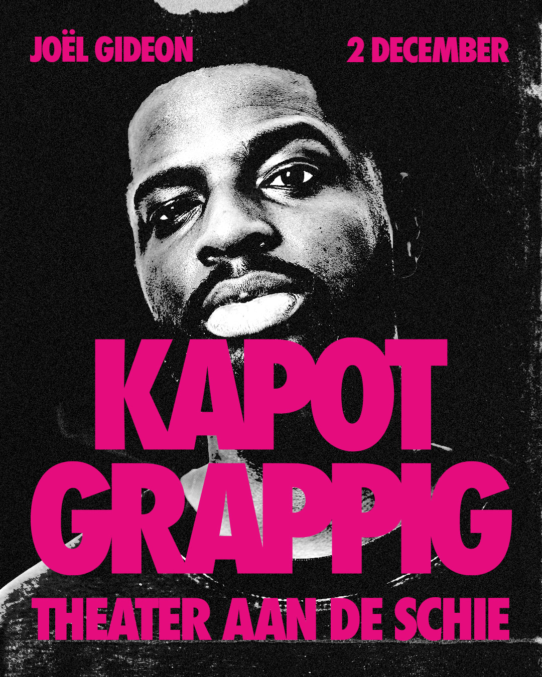
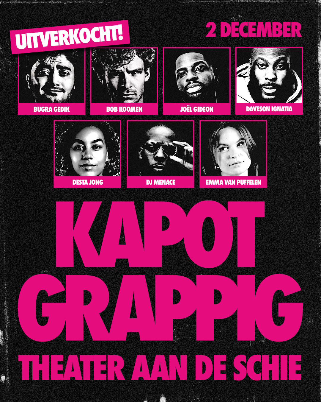
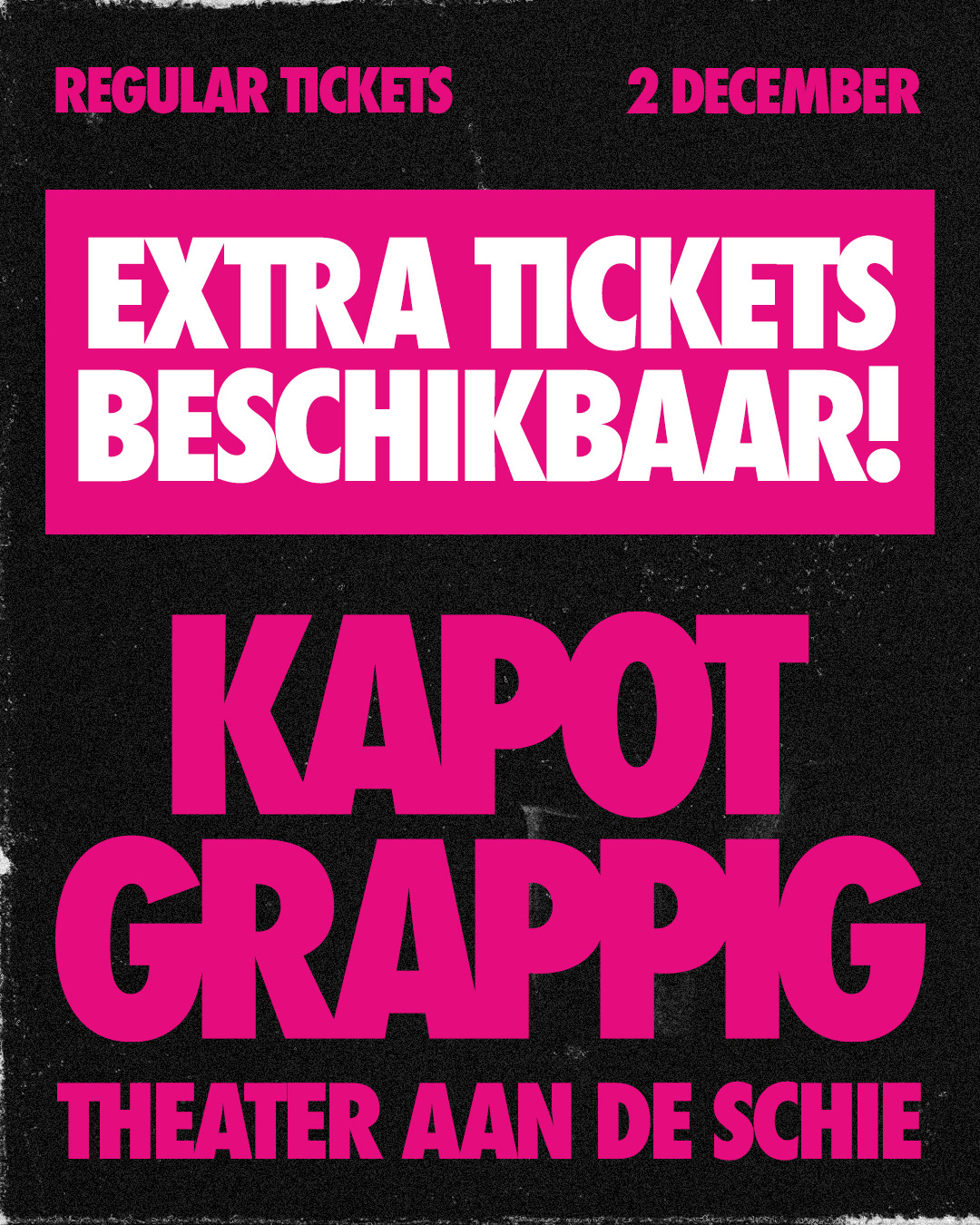
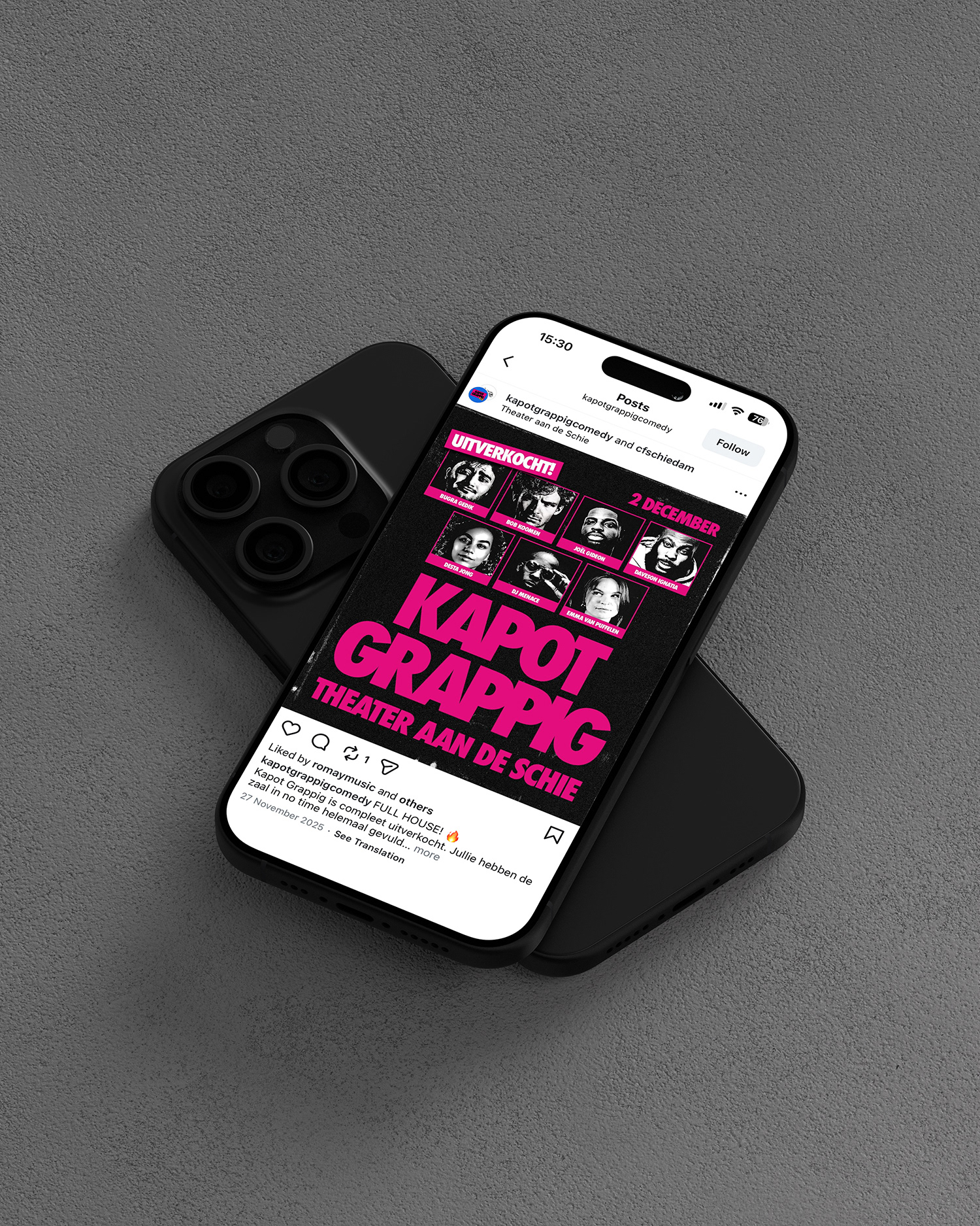
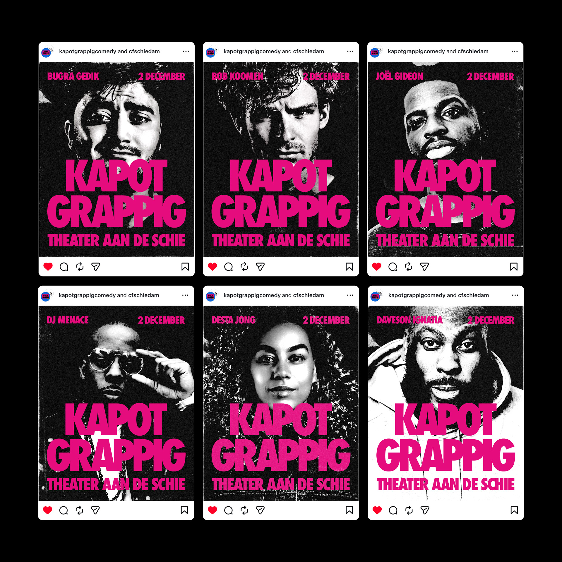
The visual language draws inspiration from threshold effects and the aesthetic of old copy machines. It carries a worn quality, something that has passed through the machine before, fitting for an edition that builds on what came before. The act of copying is part of the concept. This campaign was built with a strong focus on online, meeting the audience where they are. It includes individual Instagram posts for each act, a group post featuring the full lineup, a sold-out announcement and a printed flyer with the timeline. The sold-out post is a moment of its own, closing the ticket sales while celebrating the success of the edition.